A single overlooked number can ruin an entire design. A stretched face on a social media banner. A squashed product photo on an e-commerce page. A video with black bars on a client’s website. In almost every case, the culprit is the same: a misunderstood or ignored aspect ratio. For designers, photographers, video editors, and content creators, understanding how width and height relate to each other is not optional knowledge it is the foundation of every visual decision you make.
This guide goes beyond the basics. You will learn what aspect ratios actually are, why the math behind them matters more than most designers realize, how different industries and platforms use them differently, and how to make smarter decisions with images at every stage of a project from the first crop to the final export.
What Is an Aspect Ratio? The Real Definition
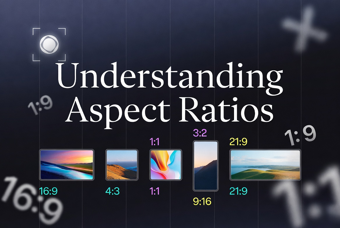
An aspect ratio is the proportional relationship between the width and the height of a rectangular shape. It is written as two numbers separated by a colon, such as 16:9, 4:3, or 1:1. The first number always represents width, and the second always represents height.
What makes aspect ratios powerful is that they describe proportion, not size. A 1920×1080 pixel image and a 1280×720 pixel image have completely different resolutions, but they share the exact same aspect ratio: 16:9. Scale either one up or down, and the proportions remain identical. This is why aspect ratios are the universal language of visual dimensions across every medium from postage stamps to cinema screens.
The concept predates digital technology by centuries. Painters, architects, and printmakers have always worked with fixed proportional systems. The golden ratio (approximately 1.618:1) appears in Renaissance paintings and ancient Greek architecture. Standard photographic print sizes like 4×6 and 5×7 were established by film manufacturers long before digital cameras existed. Today, the same underlying logic governs every screen, platform, and display format in existence.
How to Read and Simplify an Aspect Ratio
Any pair of pixel dimensions can be converted into an aspect ratio by dividing both numbers by their greatest common divisor (GCD). For example, an image that is 1920 pixels wide and 1080 pixels tall shares a GCD of 120. Divide both numbers by 120, and you get 16:9. An image that is 800×600 has a GCD of 200, which simplifies to 4:3.
This matters in practice because the same proportions can appear in many different pixel sizes. A social media post at 1080×1080, a profile picture at 400×400, and a favicon at 32×32 are all 1:1. Knowing the underlying ratio lets you resize and adapt images consistently, regardless of the target resolution.
The Most Important Aspect Ratios in Modern Design
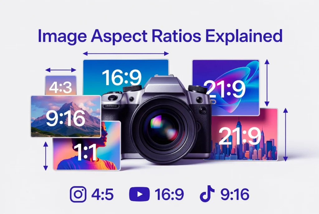
While dozens of ratios exist, a relatively small set dominates modern visual work. Understanding the origin and best use of each one will make you significantly faster and more confident in your design decisions.
16:9 — The Widescreen Standard
The 16:9 ratio became the global standard for digital video and display in the late 1990s and early 2000s, driven largely by the transition from analog to digital television. Before that shift, most screens used 4:3. The move to 16:9 was not arbitrary — it was chosen because it offered the best mathematical compromise between the older 4:3 television format and the wider 2.35:1 cinematic format, allowing a single screen shape to accommodate both without excessive letterboxing.
Today, 16:9 is the default for YouTube, most computer monitors, HD and 4K televisions, laptop screens, and presentation software like PowerPoint and Google Slides. Common pixel sizes include 1920×1080 (Full HD), 2560×1440 (QHD), 3840×2160 (4K UHD), and 1280×720 (HD). For web design, hero banners, blog thumbnails, and featured images typically use this ratio because it mirrors what most desktop users see on their screens.
4:3 — The Legacy Standard
The 4:3 ratio dominated screens from the early days of cinema through the era of cathode ray tube televisions and early computer monitors. It is a nearly square format wider than tall, but only slightly. While it has largely been replaced by 16:9 for video, it remains relevant for tablet displays, many digital camera viewfinders, and certain print formats. Tablets like the iPad have historically used dimensions close to 4:3 (the iPad Air, for example, uses 2360×1640, which is very close to this ratio). It is also a useful ratio for portrait photography intended for print, since common print sizes like 8×10 and 5×7 are close relatives.
1:1 — The Square Format
The square format has ancient roots it was the shape of the Rolleiflex and Hasselblad medium format cameras favored by professional photographers throughout the twentieth century. Ansel Adams, Irving Penn, and Richard Avedon all worked extensively in square format. In the digital era, Instagram popularized 1:1 for social media, and it remains the most reliable format for profile pictures, product thumbnails, and any image that needs to fit equally well in a grid layout.
The square is visually stable and feels balanced, which is why it works well for close-up portraits and isolated product shots. It also eliminates any ambiguity about orientation — a square looks the same whether displayed on a vertical phone screen or a horizontal desktop monitor.
9:16 — The Vertical Revolution
The 9:16 ratio is simply 16:9 rotated 90 degrees. It represents the full vertical screen of a modern smartphone the format that billions of people now use as their primary screen orientation. Instagram Stories, TikTok, YouTube Shorts, Snapchat, and Facebook Reels all use 9:16 as their native format. At 1080×1920 pixels (or 1080×1920 for most platforms), it fills the entire phone screen with no wasted space.
Designing for 9:16 requires a fundamentally different compositional approach than designing for 16:9. Elements need to be centered vertically, text must be placed in the safe zone (roughly the middle third of the frame, avoiding the top and bottom 15% where platform UI elements appear), and the visual hierarchy must work when viewed on a small, handheld screen at arm’s length rather than a large monitor at desk distance.
3:2 — The Photography Standard
The 3:2 ratio traces directly to the 35mm film format established by Leica in 1925. The actual dimensions of a 35mm film frame are 36mm × 24mm, which simplifies exactly to 3:2. This is why virtually all DSLR and mirrorless cameras capture images in 3:2 by default, and why standard print sizes like 4×6 inches and 6×9 inches are so common they were designed to accept 35mm negatives without cropping.
For photographers, 3:2 is still the most natural working format. It is slightly wider than the old 4:3 television standard but not as dramatically wide as 16:9, which means it adapts well to both landscape and portrait compositions. When delivering images for print, knowing that your camera shoots 3:2 tells you immediately that 4×6 prints require no cropping, 5×7 prints will require slight cropping, and 8×10 prints will require significant cropping.
2:3 — The Portrait Pin
The 2:3 ratio is simply the 3:2 photography standard rotated to portrait orientation. Pinterest is the dominant platform associated with this ratio, recommending 1000×1500 pixels as the optimal pin size. Portrait-oriented content consistently performs better on Pinterest because pins are displayed in a masonry grid where taller images take up more vertical space and attract more attention. For photographers, 2:3 is the natural portrait orientation of a camera held vertically.
21:9 — The Ultrawide Format
The 21:9 ratio (more precisely 64:27 in its exact mathematical form) represents ultrawide computer monitors and cinematic widescreen content. It is increasingly common in high-end gaming monitors and professional workstations. For web design, a 21:9 hero banner creates an immersive, cinematic feel that can be visually striking on large desktop screens, though it requires careful planning to ensure the design degrades gracefully on narrower screens.
2.35:1 and 2.39:1 — The Cinematic Formats
These ratios are specific to professional film production. The 2.35:1 ratio was introduced with CinemaScope in the 1950s and remains one of the most iconic cinematic proportions. The slight variation, 2.39:1, is the current SMPTE standard for anamorphic widescreen content and is the format used in most major Hollywood productions today. These ratios are relevant for video editors working with cinematic-style content and for designers creating video thumbnails or advertisements intended to evoke a filmic aesthetic.
Aspect Ratios by Platform: A Complete Reference
Every major digital platform has developed its own aspect ratio requirements based on how its interface is designed, how content is consumed, and what dimensions perform best with its algorithm and user behavior. The following is a detailed breakdown of current platform standards.
Social Media Platforms
Instagram supports multiple ratios depending on content type. Feed posts work with 1:1 (square), 4:5 (portrait), and 1.91:1 (landscape), with 4:5 at 1080×1350 pixels generally performing best because it takes up the most vertical screen space in the feed. Stories and Reels require 9:16 at 1080×1920 pixels. The safe zone for Stories the area guaranteed to be visible regardless of device runs from roughly 250 pixels from the top to 250 pixels from the bottom of the 1920-pixel height.
Facebook is somewhat more flexible, accepting a range of ratios for feed posts. However, 1.91:1 (1200×628 pixels) is the recommended ratio for shared links and advertisements, and 1:1 works well for organic posts. Facebook Stories use 9:16, matching Instagram. Facebook cover photos use a unique 2.7:1 ratio at 820×312 pixels.
Twitter (now X) displays images in the timeline at approximately 16:9, though images are cropped to fit the preview rather than displayed in full. For the best in-feed presentation, 16:9 at 1600×900 pixels is optimal. Twitter’s profile picture uses a circular mask over a square image, so important elements should be centered within the frame.
LinkedIn recommends 1.91:1 for shared article images and sponsored content, and 1:1 for company logo images. The platform’s interface is primarily desktop-first, which means landscape formats tend to perform better here than on more mobile-centric platforms.
Pinterest strongly favors 2:3 (1000×1500 pixels) for standard pins. The platform’s vertical masonry grid rewards taller images with greater visual real estate. Pins taller than 2:3 can be created but may be truncated in the feed after a certain height threshold.
TikTok is designed exclusively for 9:16 vertical video at 1080×1920 pixels. Unlike Instagram Reels, TikTok has a more aggressive safe zone keeping key visual elements and text within the central 80% of the frame is recommended to avoid overlap with the interface controls on the right side and the caption area at the bottom.
YouTube uses 16:9 as its primary video format at any resolution from 720p to 4K. YouTube Shorts follows TikTok and Instagram Reels with 9:16. Channel art (the banner displayed at the top of a YouTube channel page) uses a 16:9 canvas but displays differently on different devices the safe zone for text and logos is the central 1546×423 pixels of the full 2560×1440 banner.
Print Formats
Print design involves a different kind of precision than screen design, because the final output is physical and cannot be adjusted after printing. Understanding the aspect ratio of a print format before beginning to design prevents the most common and frustrating print mistake: discovering that your image does not fit the paper.
Standard photographic print sizes in the United States follow a relatively consistent set of ratios. The 4×6 inch print (3:2) is the most common and matches the native aspect ratio of most DSLR cameras, meaning no cropping is required. The 5×7 inch print uses a 5:7 ratio, which is close to but not identical to 3:2 a slight crop is required from a standard camera image. The 8×10 inch print uses a 4:5 ratio and requires a more significant crop from 3:2 source material, particularly if the image is in landscape orientation. The 11×14 inch print (11:14) and the 12×18 inch print (2:3) each have their own proportions, and 12×18 is the only standard large print that accepts a 3:2 image with no cropping.
Business cards in North America use a 3.5×2 inch format (7:4), while European business cards use an 85×55mm format (approximately 17:11). Brochure formats vary widely, but the most common tri-fold brochure uses a letter-sized sheet (8.5×11 inches, approximately 17:22) folded into three equal panels, each panel being roughly 3.67×8.5 inches (a very tall, narrow portrait orientation).
Video and Broadcast
Broadcast television has standardized on 16:9 for HD content worldwide. Standard definition television historically used 4:3, which is why older content displayed on modern widescreen TVs shows black bars on the sides (pillarboxing). When 4:3 content is stretched to fill a 16:9 screen, the result is visible distortion a problem still encountered in poorly configured digital signage and some streaming interfaces.
Digital cinema uses several established formats. The DCI 4K standard (4096×2160) uses a ratio very close to 1.9:1. The scope format (2.39:1) is achieved by letterboxing this 1.9:1 container to produce the familiar ultra-wide cinematic look. The flat format (1.85:1) is the most common alternative, producing a look slightly wider than 16:9 without the extreme horizontal stretch of scope.
The Mathematics of Resizing Without Distortion
Distortion happens when width and height are not scaled proportionally. This sounds obvious, but it is one of the most common mistakes made when working with images, particularly when resizing to fit a specific container size that does not match the original aspect ratio.
The core formula is straightforward. To find the new height when you have a new width, multiply the new width by the original height, then divide by the original width: New Height = (New Width × Original Height) ÷ Original Width. To find the new width when you have a new height: New Width = (New Height × Original Width) ÷ Original Height.
For example, suppose you have a 1200×800 image (3:2 ratio) and you need to resize it to 900 pixels wide. The new height would be (900 × 800) ÷ 1200 = 600 pixels. The resized image at 900×600 maintains the 3:2 ratio perfectly.
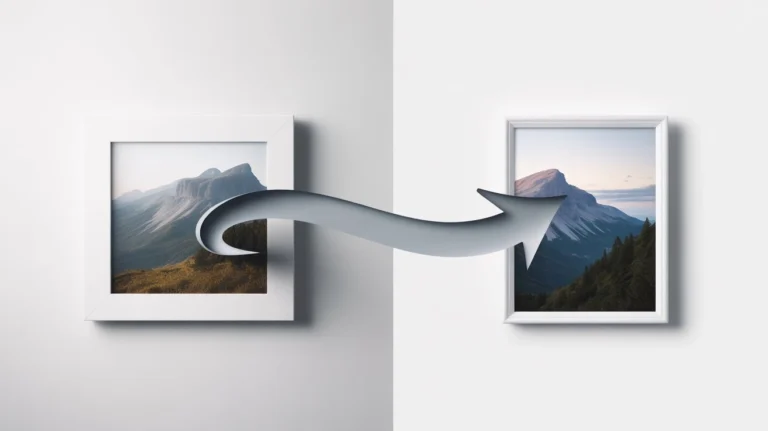
Where this becomes more complex is when the target container has a different aspect ratio than the source image. A 3:2 landscape photograph that needs to fit a 1:1 square container cannot be simply resized it must either be cropped, or it must be contained within the square with empty space (letterboxing or pillarboxing) added to the sides. Stretching it to fill the square would produce a 33% vertical distortion, which is immediately visible to any viewer.
Crop vs. Contain vs. Stretch: Choosing the Right Strategy
When source and target aspect ratios do not match, there are three possible strategies. Each has legitimate uses, but one stretching — should almost never be used for photographic or illustrated content.
Cropping fills the entire target area with the image by cutting away parts of the image that fall outside the target ratio. This is the right strategy when the full image filling the container is more important than showing every pixel of the original. The compositional challenge is deciding what to crop away. For portraits, cropping typically happens at the sides. For landscapes, cropping typically happens at the top or bottom. The rule is to retain the most visually important part of the image usually the subject and crop away less critical areas like sky, ground, or background.
Containing (or letterboxing/pillarboxing) displays the entire image within the target area while adding empty space usually black, white, or a background color to fill the remaining area. This is the right strategy when showing the complete image is more important than filling the container edge to edge. It is the standard approach for video players displaying content that does not match the screen ratio, and it is often used in print when an image cannot be cropped without losing essential content.
Stretching forces the image to fill the target area by independently scaling the width and height, which inevitably distorts the image. People look too wide or too tall, circles become ovals, and straight lines take on a skewed appearance. The only legitimate use of stretching is for pure abstract textures or backgrounds where the distortion is not perceptible never for photography, illustration, typography, or any content with recognizable forms.
Aspect Ratios in Responsive Web Design
The web adds a layer of complexity that print and fixed-format video do not have: images must adapt to screens of many different sizes and aspect ratios simultaneously. A hero image that looks perfect on a 27-inch desktop monitor needs to work equally well on a 6-inch phone screen, a 10-inch tablet, and everything in between.
The CSS aspect-ratio Property
Modern CSS includes a native aspect-ratio property that eliminates much of the complexity involved in maintaining proportions in fluid layouts. Declaring aspect-ratio: 16 / 9 on any element tells the browser to automatically calculate the height based on whatever width the element has at any given moment. As the screen narrows or widens, the height adjusts to maintain the 16:9 proportion without any JavaScript required.
This property is particularly valuable for image containers, video embeds, and any other element whose contents have a fixed internal aspect ratio. Before this property was widely supported, developers relied on a padding-based hack setting padding-bottom to a percentage equal to the ratio’s height divided by its width (56.25% for 16:9) which achieved the same visual result through a more roundabout mechanism.
The object-fit Property
When images are placed inside containers with fixed dimensions or fixed aspect ratios, the object-fit CSS property controls how the image fills the space. The cover value instructs the browser to scale the image up until both dimensions are at least as large as the container, then crop the excess equivalent to the cropping strategy described above. The contain value scales the image to fit entirely within the container, maintaining proportions but potentially leaving empty space equivalent to the contain strategy. The fill value stretches the image to match the container exactly, ignoring the aspect ratio this is the stretch strategy and should generally be avoided.
Combining aspect-ratio on a container with object-fit: cover on the image inside it is one of the most powerful and commonly used patterns in modern responsive design. The container maintains the desired ratio at any screen width, and the image always fills the container completely without distortion, cropping automatically to the most centered portion of the image.
Art Direction for Different Breakpoints
Responsive design sometimes requires not just resizing an image, but fundamentally rethinking how it is cropped for different screen sizes. A landscape hero image showing a full cityscape on desktop might crop awkwardly on mobile, leaving the most important subject a person, a building, a product at the edge of the frame or cut off entirely.
The HTML <picture> element with multiple <source> elements solves this by allowing different image files (and therefore different aspect ratios and compositions) to be served at different breakpoints. A single subject like a product can be shown in a wide 16:9 crop on desktop, a square 1:1 crop on tablet, and a tall 4:5 portrait crop on mobile each version specifically composed for its target context.
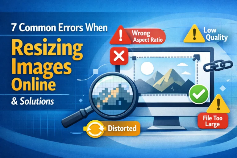
Common Aspect Ratio Mistakes and How to Avoid Them
Even experienced designers make aspect ratio errors, particularly under deadline pressure or when working across multiple platforms simultaneously. The following are the most common mistakes and the specific habits that prevent them.
The first and most frequent mistake is resizing an image by dragging only one handle in an image editing application. In most software, holding Shift while dragging constrains proportions. Not holding Shift or not using the constraint lock in the dimensions panel scales only one dimension and produces immediate distortion. The fix is to always use the dimensions panel with the aspect ratio lock enabled, never to drag handles freehand when precise proportions matter.
The second common mistake is assuming that all square-ish formats are the same. A 4:3 tablet screen, a 5:4 old monitor, and a 1:1 Instagram post are all roughly square, but they are not the same proportion. Content designed for one will not fill another without cropping or letterboxing. Always check the exact target dimensions of the platform or device before starting a design.
The third mistake is not checking how images appear on multiple devices after publication. An image that looks perfectly composed on a large monitor may crop differently on a phone if the CSS is applying automatic cropping based on container dimensions. Always test published images on at least two or three different screen sizes before considering a design complete.
The fourth mistake is starting to design without establishing the aspect ratio of the output first. This is especially common in logo and illustration work, where designers sometimes create artwork in an arbitrary canvas and then try to fit it into a specific format later. The correct approach is always to set the canvas dimensions to match the final output before starting, so every compositional decision is made with the correct proportions in mind.
Aspect Ratios in Photography: From Capture to Output
For photographers, aspect ratio decisions happen at three distinct stages: during capture, during editing, and during delivery. Managing these three stages intelligently prevents the frustrating situation of discovering that an image cannot be delivered in the requested format without losing important compositional elements.
During capture, most cameras offer a choice of aspect ratio in their menu settings. The native ratio for most DSLRs and mirrorless cameras is 3:2. Many cameras also offer 4:3, 1:1, and 16:9 modes. However, these in-camera crops only affect the JPEG output when shooting in RAW format, the full 3:2 sensor area is always captured regardless of the selected ratio. This means RAW shooters can always adjust the crop in post-processing with no loss of flexibility. Photographers who shoot JPEG only should be more deliberate about selecting the correct aspect ratio in camera if they know the final delivery format.
During editing, cropping is one of the most consequential decisions a photographer makes. Changing the aspect ratio changes the visual weight, tension, and composition of an image in ways that are not always obvious in advance. Cropping a 3:2 landscape to 1:1 does not simply remove the sides it changes the relationship between the subject and negative space in ways that can strengthen or weaken the image. Photographers who regularly deliver in multiple formats often make separate cropped versions of their best images rather than trying to find a single crop that works everywhere.
During delivery, the most common source of errors is a mismatch between the delivered ratio and the required format. A client who orders 5×7 prints from 3:2 source files will receive automatically cropped prints if no manual crop is applied and the automated crop may not preserve the intended composition. The best practice is to crop images to the exact delivery format before ordering prints or providing files to a client, with the cropped version explicitly labeled so there is no ambiguity about what was intentional.
Frequently Asked Questions
What is the difference between aspect ratio and resolution?
Aspect ratio describes the proportional relationship between width and height for example, 16:9. Resolution describes the actual number of pixels for example, 1920×1080. Two images can share the same aspect ratio while having completely different resolutions (and therefore different file sizes, print quality potential, and bandwidth requirements). A 3840×2160 image and a 1920×1080 image are both 16:9, but the first contains four times as many pixels as the second. Resolution determines quality and detail; aspect ratio determines shape and proportion.
Why do some platforms show my images with unexpected cropping?
Most platforms automatically crop images that do not match the expected display ratio. The crop is typically centered, meaning the platform removes equal amounts from both sides (for width) or from the top and bottom (for height). If the most important elements of your image are not centered, the automatic crop may cut them out. The solution is to always compose with the platform’s required ratio in mind from the start, or to manually crop to the exact required ratio before uploading.
Is the golden ratio useful in practical design work?
The golden ratio (approximately 1.618:1) appears frequently in discussions of design theory and is genuinely present in some natural forms and classical art. However, its practical application in modern digital and print design is limited. Most standard formats 16:9, 3:2, 4:3 do not conform to the golden ratio and were chosen for practical reasons related to screen manufacturing, camera sensors, and print paper sizes rather than aesthetic theory. The golden ratio is worth understanding conceptually, but it should not be imposed on a project that has specific platform or output requirements.
How do I handle images that are not standard ratios?
Non-standard ratios appear frequently in practical work screenshots from unusual devices, images supplied by clients without preparation, or photos from cameras with non-standard sensors. The options are the same as for any ratio mismatch: crop to the target ratio, contain within the target ratio with padding, or accept that the image will display with slight letterboxing or pillarboxing in some contexts. When cropping, focus on retaining the most compositionally important part of the image. When containing, choose a background color that complements the image and the surrounding design.
What aspect ratio should I use for a website hero image?
For most websites, a 16:9 or 21:9 ratio works well for desktop hero images. However, because hero images display across a wide range of screen widths, the most important consideration is which portion of the image must remain visible at all times. The CSS object-fit: cover property is almost universally used for hero images, meaning the browser will automatically crop the image to fill the container. Design your hero composition with a central focus point and important elements kept well away from the edges, so the image remains effective even when cropped to different ratios on different screen sizes.
Why do black bars appear on some videos?
Black bars appear when a video’s aspect ratio does not match the screen or player’s aspect ratio. Horizontal black bars at the top and bottom (letterboxing) appear when the video is wider than the screen. Vertical black bars at the sides (pillarboxing) appear when the video is narrower than the screen. Both are the result of the player choosing to display the full video frame at the correct proportions rather than cropping it to fill the screen. In most cases, letterboxing is the correct and intentional behavior for cinematic content displayed on a 16:9 screen.
Conclusion: Proportion as a Design Foundation
Aspect ratios are one of those foundational concepts in design that repay careful study many times over. They touch every part of the visual process from how you compose an image in the camera or on the canvas, to how you resize and crop during editing, to how the final image displays across every platform and device where it will be seen. A designer who understands aspect ratios works faster, makes fewer errors, and produces more polished results at every stage.
The practical habits that follow from this understanding are simple but powerful. Always establish the target aspect ratio before beginning a design. Always lock proportions when resizing. Always think about where automatic cropping will occur when designing for platforms that do not match the source image ratio. Always test final designs on multiple screen sizes before publishing. And always keep master copies at native resolution so that resizing for new formats never requires working from an already-degraded file.
Proportion is not just a technical constraint it is a fundamental element of visual composition. The best designers do not just comply with aspect ratio requirements; they use them as a creative starting point, letting the shape of the canvas inform every compositional decision from the first mark to the final export.